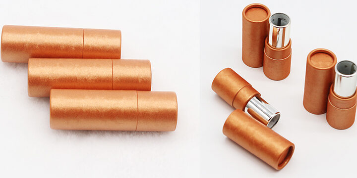
If you heard that 65% of the Lipstick tube packaging sold in Europe were yellow, would you use this color in your design to boost your sales?
The psychology of colors can be a delicate subject. For example, some companies work for several months to create their “graphic charter”. While others are decided instantly. So, some brands take this subject very seriously and others do not.
Nevertheless, one thing is certain – there are no pre-defined answers. Despite this, it is always better to have some knowledge in this area. For example, this will help you decide if the yellow is really a sales booster or just a random fact.
Have you ever wondered why airlines (Ryanair, KLM, Turkish Airlines, Lufthansa, etc.) use blue as their main color? The explanation is simple – blue evokes reliability.
Or why Subway chose yellow and green? The first color is jovial (the brand wants to attract young people) and green is a color that represents freshness.
In fact, the colors chosen for your design must be chosen carefully. So here are the most used colors and the message they convey to your customer.
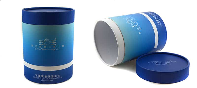
- Blue is the color of the sea and the sky. It is a relaxing color, associated with confidence, efficiency, serenity, logic and intelligence. As a result, this is a very common choice for designs. Many international companies incorporate blue in their image – Facebook, Twitter, IBM, Vimeo, etc … And if you take a look at Packhelp – you will notice that we have also chosen light blue in our logo.
- Unlike blue, Red is a fierce color associated with ardor, passion, excitement, warmth and strength. Red is generally used for entertainment and lifestyle businesses. For example: Netflix, Coca-Cola, Disney, McDonald’s, Marlboro and Lego.
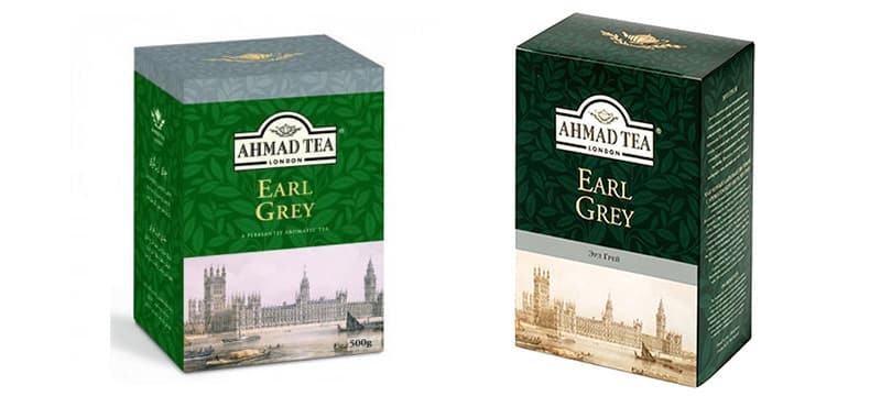
- Green is associated with the Earth. This color is soothing, soothing, balancing, long-lasting, harmonious and refreshing. Green is used by many large companies – Subway, Spotify, Starbucks, Lacoste and Xbox.
- Yellow is an extremely emotional and jovial color. Nevertheless, it is rarely used in main color. But some companies use it to brighten up their design like McDonald’s and Imdb.
- In general, Black is used for elegant and high-end brands. For example, it is often associated with white elements.
Choose your color palette
The best approach to choosing your color palette is to put yourself in the customer’s position. For example, if you want a professional look but do not appear too “sociable”, choose blue. Agencies and marketing companies that want to build trust with their packaging can use blue.
If your brand is more cheerful, try to find a mix of bright and warm colors. For example, yellow and red work for a dynamic image, targeted for passionate people.
Every time you target customers who value your attention to environmental issues, green and brown will amplify this perception.
Cosmetics, fair trade products and even clothing – all of these things can benefit from green packaging. However, use these colors carefully – especially green that can become boring if used excessively.
Finally, remember, that each package depends on the details. For example, a delicate background – such as kraft or white cardboard – amplifies black prints.
Other important things
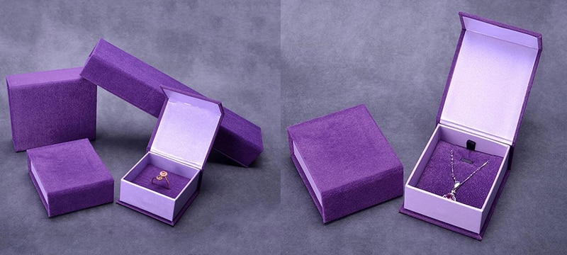
When designing your packaging, remember that color preferences change according to age and son-in-law. A study indicates that blue is really the color that far outstrips all others, regardless of age. If you are targeting children, avoid red – your design will essentially be green and blue. Teens and thirties tend to like purple, which can be, very attractive in a package. When dark, it will attract young people. Also, remember this golden rule – the majority of people do not like orange.
When it comes to gender differences, men prefer blue. More than 57% admit that they prefer this color. Green and black are also good choices for a male brand. In addition, women too, like blue but purple, red and green are also good choices for a more feminine brand.
What about shades and combinations?
If you’ve known the 90s, you may remember, clothes with very bright colors and designs that made tons. In fact, it was on the verge of visual aggression!
Nowadays, the approach is different. In the era of Instagram filters and clean galleries of social networks, the trend is minimalism.
In the packaging, minimalism translates into a brown kraft cardboard and a black print. Or, a white card and a black print. In addition, it is important to choose visible colors, delicate and a small font. From now on, it is the details that are at the center of the stage – like an intelligent and catchy phrase, or the impression of a beautiful artistic motif.
Suggestion at the end
Packaging design, in addition to form, materials and texture, must focus on colors. So, look for your colors and establish your doubts, if you have any. Even if there is a lot of speculation around the colors, it is better to be prepared before making a final choice. To conclude, define your brand and see what others are doing in your niche – so you’ll find the best combination that will work with your brand.

