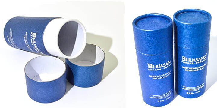
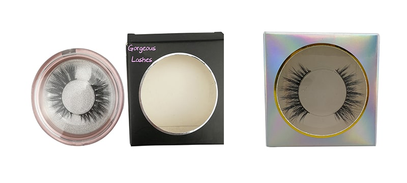
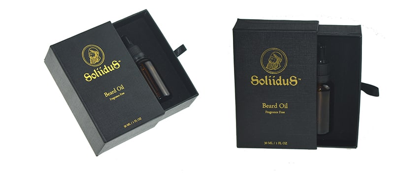
Packaging is an integral part of our environment, both on the internet and in real life. Nobody can escape. Fortunately, they evolve each year to meet our tastes and needs. And at the top of this list of needs is our dependence on online stores. Recreating an experience similar to that of IRL (in real life) shopping on the Internet can be a pretty challenging task… Anyway, what really matters is being able to unpack the product, right?
- Simplicity
The minimalist trend is not new and is not about to go away. Although minimalist designs can sometimes be perceived as abstract or even primitive, it is important to be simple to facilitate the accessibility of a design and thus make its intuitive use.
The most difficult part, is to find the symbols and signs to which the public will be able to identify themselves. Afterwards, the message is self-sufficient, with only a few words – if at all. Using fewer words and more symbols is a reflection of today’s fast-paced society: consumers just have time to stop for two minutes to understand what your product is.
- Pastels
The soft and feminine packaging will take its place in 2019, which means that the pastel colors will return to the front of the stage. This trend is evident in the highly stimulating and vibrant environment in which we live. The fact that these tones are low saturated makes it an ideal choice to create a soft and reassuring effect, and give the consumer products a good aura, which results in a pleasant feeling and welcoming to the public. Instead of hurrying and being inspired to look, feel, touch or even taste, we cajole and seduce us gently. After all, the color is only light, however, the light of energy! And the materialized energy has an impact on people’s feeling.
- Doodles
Everyone, from 9 to 99 years old, scribbles. You will not be able to do more for your targeted audience! Adults identify with this type of design because it reminds them of the joys of childhood. And do not hide the fact, even the most grumpy smile at seeing a little scribble. When this technique is used to create the design of a product’s packaging, it’s a whole universal fun that comes straight out of the imagination of someone associated with the product. Doodles are also a great way to describe the product inside the box. Often, we smile even before touching the product, thus you will always have happy customers.
- Movie Posters
What can be a better way for brands to seduce us with a familiar atmosphere evoked than through a movie poster? Brands that opt for a poster design based on a film can also rely on the many existing fans and passionate collectors to find new customers. We can hardly do better to expand our target audience…
- XXL letters
If you want to communicate a message without any ambiguity, the extra-large lettering is for you to choose. Playing with typography is a good creative way to communicate about your product. Funny or serious, this technique works regardless of the nature of your message, as long as you use a font size and easy to read. Combined with a beautiful color palette, you can be sure to get noticed and have your customers impressed in a very quick way.


